Michigan’s present and future face includes more wrinkles and more color
Excitement came to Michigan, at least in some parts, in late 2012 when the Census Bureau proclaimed that Michigan’s population had increased over the previous year for the first time in seven years.
Our total population was up to 9,883,360, but we knew little of its characteristics. We could surmise that we were getting older, since birth numbers were continuing to decrease and our in-migration numbers were not bringing youth to our shores. And trends were pointing toward a more diverse population: fewer whites, more people of color.
We now have the data and the results clearly support our predictions. This brief analysis will provide an overview of age and race/ethnic trends as of 2012, and then combine the two to provide a picture of where we are going.
We are indeed getting older. In 2000 Michigan’s median age stood at 35.5 years. By 2010 we were at 38.9 years. This aging was the 4th largest in the country. Ahead of us were Maine, New Hampshire and Vermont, and just behind were Delaware, Rhode Island, Connecticut and Massachusetts. The 2012 estimates added another half year to our average age, bringing us to 39.4 years.
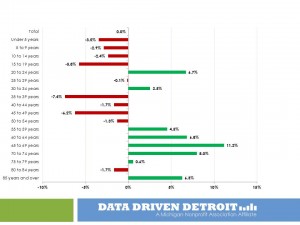
Figure 1 illustrates why we are aging. With the exception of the 20-24 year cohort, where growth is attributable to out-of-state college students and a demographic bubble of younger millenials, and the 30-34 year cohort, a major category for new immigrants, Michigan’s growth was concentrated in the population 55 years and above – dominated by baby boomers.
Figure 1. Michigan Population Change by Age Cohort, 2010 – 2012
In addition to becoming older, Michigan is becoming more diverse. As we will see later, our increasing diversity is helping to keep our median age from growing even faster than it already is.
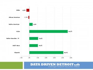
When we analyze population change across racial/ethnic groups between 2000 and 2012 (Figure 2), we immediately see the 3.5 percent decrease in Michigan’s white non-Hispanic majority. In spite of a loss in their ranks, white non-Hispanics still account for more than three-quarters (76 percent) of Michigan’s population. This is down from 78.6 percent in 2000. African Americans also experienced a loss of population, while holding on to their 14 percent share, as many chose to migrate out of Michigan, primarily to states in the south. While all other groups experienced population gains, the major winners were the Asian and Latino populations, growing by 44 and 41 percent, respectively*. Asians now account for 2.6 percent of Michigan’s total (up from 1.8 percent in 2000) and Latinos account for 4.6 percent (up from 3.3 in 2000).
Figure 2. Michigan Population Change by Race / Ethnicity, 2000 – 2012
Now that we have the big picture, it is time to delve more deeply into the age structure of each of our groups. This will be done through the use of population pyramids, which illustrate the share of population accounted for by each 5-year age cohort (with the exception of the top cohort of 85 years and over) within gender. Let us start with an overview of Michigan’s total population.
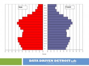
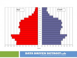
Figure 3 provides a picture of Michigan’s population in 2012. It is clear from the outset that the figure no longer resembles a pyramid. That shape did exist back in the heyday of the baby boom when birth counts were at their highest, lifespans were shorter and children represented the longest bars of the graph. Now we see those boomers driving the long bars between 45 and 64 years of age, and their offspring millennials providing a slight bulge between 19 and 30. One other characteristic that you can see is the age by gender structure that I reported on not too long ago. Male age bars outdistance female bars up to the age of 29 and then women take over. Once we get near the top, the blue bars begin to approach twice the length of the red.
Figure 3. Michigan Population Pyramid – Total Population in 2012
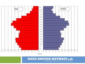
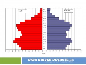
We will now take a look at how the pyramids play out across the individual race and ethnic groups, beginning with white, non-Hispanics (See Figure 4). The fact that whites represent 76 percent of the state’s total would lead one to expect that the pyramids would be very similar. A quick look would confirm that this is essentially true. However, a deeper look will show subtle differences on the extremes. Whites tend to live longer than other groups and have had a longer history in Michigan as well. As a result, you will see that all bars from 45 years of age on are longer for white, non-Hispanics than the population as a whole. On the other end of the spectrum, whites are accounting for a smaller and smaller percentage of total births each year. In fact, national numbers now show them accounting for less than half of all births. As a result, the bars for age groups below 25 years of age are all smaller, with the discrepancy growing as one goes down in age.
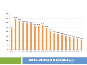
Figure 5 illustrates this increasing diversity with decreasing age. Each bar represents the share of that age cohort that is comprised of persons of color (anyone who is not classified as a person of color). The pattern of increasing share with decreasing age is almost constant, with the exception of the upward blip that shows up in the 35 – 39 years of age cohort. This blip represents the large waves of immigrants, most persons of color, that arrived during the 1990s and early 2000s, many falling in the age range from 25 years to 34 years of age upon arrival.
Figure 4. Michigan Population Pyramid – White, non-Hispanic Population in 2012
Age groups that meet or exceed the share of white, non-Hispanics statewide begin at the age of 40 and grow from there. All groups below that point exceed the overall share of persons of color, with the highpoint of 34.4 percent reached in the youngest cohort. Is it any wonder why the white pyramid looks the way it does?
Figure 5. Percent Persons of Color by Age Group in Michigan, 2012
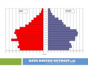
Figure 6 illustrates the age by gender distribution of Michigan’s African American population. The most significant difference with that of whites is the lack of a “baby-boom bulge.” In fact, the pyramid becomes very rectangular as one goes from the age of 25 to 60 years, with each cohort representing smaller shares of the whole than they do for whites. The largest segments run from 10 to 24 years of age, followed by a significant drop at 25 years of age. This is also the point where females take the lead from males. While the reasons are not obvious, one can attribute a male decrease to higher rates of homicide and incarceration. In addition, this is the age of highest mobility, leading to the supposition that this is the group leading the African American outmigration from Michigan.
Figure 6. Michigan Population Pyramid – African American Population in 2012
The Native American population is represented in Figure 7. The pyramid structure is quite similar to that of the population as a whole. The longest bars are represented by the two major population generations – baby boomers and Millennials. One also notices that the cohort bars below the age of 19 are all longer than those for the white population. It is interesting to note that the common pattern of longer bars for males in the lower age groups holds true but, in addition, males hold their own with women well into their 50s. The advantage that women have by the age of 30 does not appear to hold for Michigan’s Native American population. Shorter lifespans also show themselves in the comparatively shorter bars in the upper age cohorts.
Figure 7. Michigan Population Pyramid – Native American Population in 2012
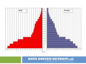
Figure 8. Michigan Population Pyramid – Asian Population in 2012
The Asian population exhibits a very different composition (See Figure 8). While the lower age bars are longer than those for whites, they are not very different from the African American population, due to very similar birth rates. The significant difference from all other groups is in the middle years – from 25 to 44 years of age. The large impact of immigration that impact has had for the Asian community has helped to concentrate population in the younger adult years. There is no baby-boom generation driving population growth. The other anomaly is the 4.6 percent share represented by males between 20 and 24 years of age. This represents the large segment of the population attending Michigan universities on student visas – a segment that is male dominated. This is a population segment that the Governor has made a point of identifying as critical for the state to hold on to after graduation. This is a critical component of the Welcoming Michigan campaign.
While it is difficult to categorize the multi-race population, I have included them in this analysis because of their pyramid design (See Figure 9). Here we see a “true” pyramid with a base strong enough to hold all that comes above. More than 15 percent of their total is less than 5 years of age. This compares to only 5 percent for the white, non-Hispanic population. If we think about racial identification options in the Census we can understand who we might be including within this population. A large segment of the Middle Eastern and other ethnic groups who did not feel represented in the “race” question were likely to select more than one race, using the “Other Race” category to list their ethnic heritage. Profiles of Arab and Chaldean ancestry populations show very similar patterns. The rise in interracial marriage has resulted in a large rise in multi-race births in recent years, further driving the bottom of the pyramid.
Figure 9. Michigan Population Pyramid – Multi-Race Population in 2012
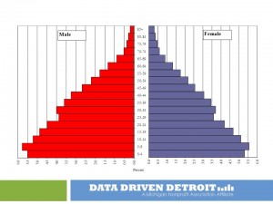
Our final pyramid (Figure 10) highlights the age and gender distribution of Michigan’s second fastest growing group (number 1 in terms of numerical gain), the Hispanic or Latino population. The picture you see is that of almost the perfect pyramid – very reminiscent of the picture one might see of Michigan’s overall population in 1960. Immigration, combined with higher than average birth rates, have resulted in a general pattern of increasing bar length as one goes down the age structure. There is the one exception at 25 – 29 years of age, which I am unable to explain, and another decrease in the most recent cohort – the group under 5 years of age. Recent trends of decreasing teen births, coupled with increases in the educational attainment of Latino women, points to decreasing birth rates in the future. Nevertheless, the large number of Latino women in their child-bearing years means that their numbers will continue to grow, regardless of future immigration rates.
Figure 10. Michigan Population Pyramid – Hispanic/Latino Population in 2012
We have come to the conclusion of our journey. I hope you have enjoyed the trip and come away with a new understanding of Michigan’s demographic future. It is a future that is shared, to one degree or another, with every state in the country. We are becoming more diverse with each successive year. It is this diversity which must be embraced as a strength going forward. It is a diversity of culture, of talents, of ideas, of experience that will form the tapestry of Michigan in the years to come. Let us all support diversity and human rights in all its forms. It is that diversity that will make for a successful future and a great ride ahead.
Kurt Metzger is director of Data Driven Detroit, a nonprofit in Detroit established by foundations to build greater capacity for people to work together, and improve lives and communities affiliated with the Michigan Nonprofit Association. He was research director for United Way for Southeastern Michigan from 2005 to 2008 and before that, was a director at the Center for Urban Studies at Wayne State University.
* Global Detroit, in collaboration with Data Driven Detroit, has just published a detailed look at the foreign born population of metro Detroit, with an interesting analysis of the demographics of our Asian and Latin American immigrants.
Business Watch
Covering the intersection of business and policy, and informing Michigan employers and workers on the long road back from coronavirus.
- About Business Watch
- Subscribe
- Share tips and questions with Bridge Business Editor Paula Gardner
Thanks to our Business Watch sponsors.
Support Bridge's nonprofit civic journalism. Donate today.
See what new members are saying about why they donated to Bridge Michigan:
- “In order for this information to be accurate and unbiased it must be underwritten by its readers, not by special interests.” - Larry S.
- “Not many other media sources report on the topics Bridge does.” - Susan B.
- “Your journalism is outstanding and rare these days.” - Mark S.
If you want to ensure the future of nonpartisan, nonprofit Michigan journalism, please become a member today. You, too, will be asked why you donated and maybe we'll feature your quote next time!


 Kurt Metzger is director of Data Driven Detroit, a nonprofit in Detroit established by foundations to build greater capacity for people to work together, and improve lives and communities affiliated with the Michigan Nonprofit Association. He was research director for United Way for Southeastern Michigan from 2005 to 2008 and before that, was a director at the Center for Urban Studies at Wayne State University.
 click to enlarge
 click to enlarge
 click to enlarge
 click to enlarge
 click to enlarge
 click to enlarge
 click to enlarge
 click to enlarge
 click to enlarge
 click to enlarge